Mercedes-Benz is a well-established brand in the Automobile industry. Not only are they known to offer good-quality cars, but they also have a wide array of products in its roster including: Collections, Wheels, Car Care, among others.
For each type of product they offer, they have different online shops. They have doing well in this set-up, but to keep up with the changing times, and to also improve their customers’ experience, they would like to consolidate all these shops and have everything in one. The goal is to be 100% online, offering all their products in a luxurious experience.
PROJECT
CHALLENGE
Mercedes-Benz has different online shops for each product category they offer. With this, it can get confusing and overwhelming for their customers, especially if they want to purchase different products at the same time. As a luxury brand, customers also expect that luxury reflects in their experience. It is also part of the challenge that there are already existing components that must be prioritised and considered when designing, but new ones can also be created, if necessary.
As the only UX Designer in the project, I am tasked to redesign their website and create design solutions for new concepts. I work closely with the product owners and occasionally do working sessions with them. Within our Breakdown sessions, I present the flows and reasons behind the designs, and with their feedback, I find a compromise and create iterations accordingly. Once aligned and finalised, I then discuss give the designs to the to the development team.

DESIGN PROCESS

I did competitor analysis and benchmarking to find out how other companies solved similar issues. And at the same time, I checked the existing different shops of Mercedes-Benz.
Based on my research, I created solution design options with existing components I mind, but also created new components, for specific new concepts.

I present the designs to different stakeholders and using their feedback, I create iterations before discussing and forwarding the designs to the developers.
RESEARCH AND ANALYSIS
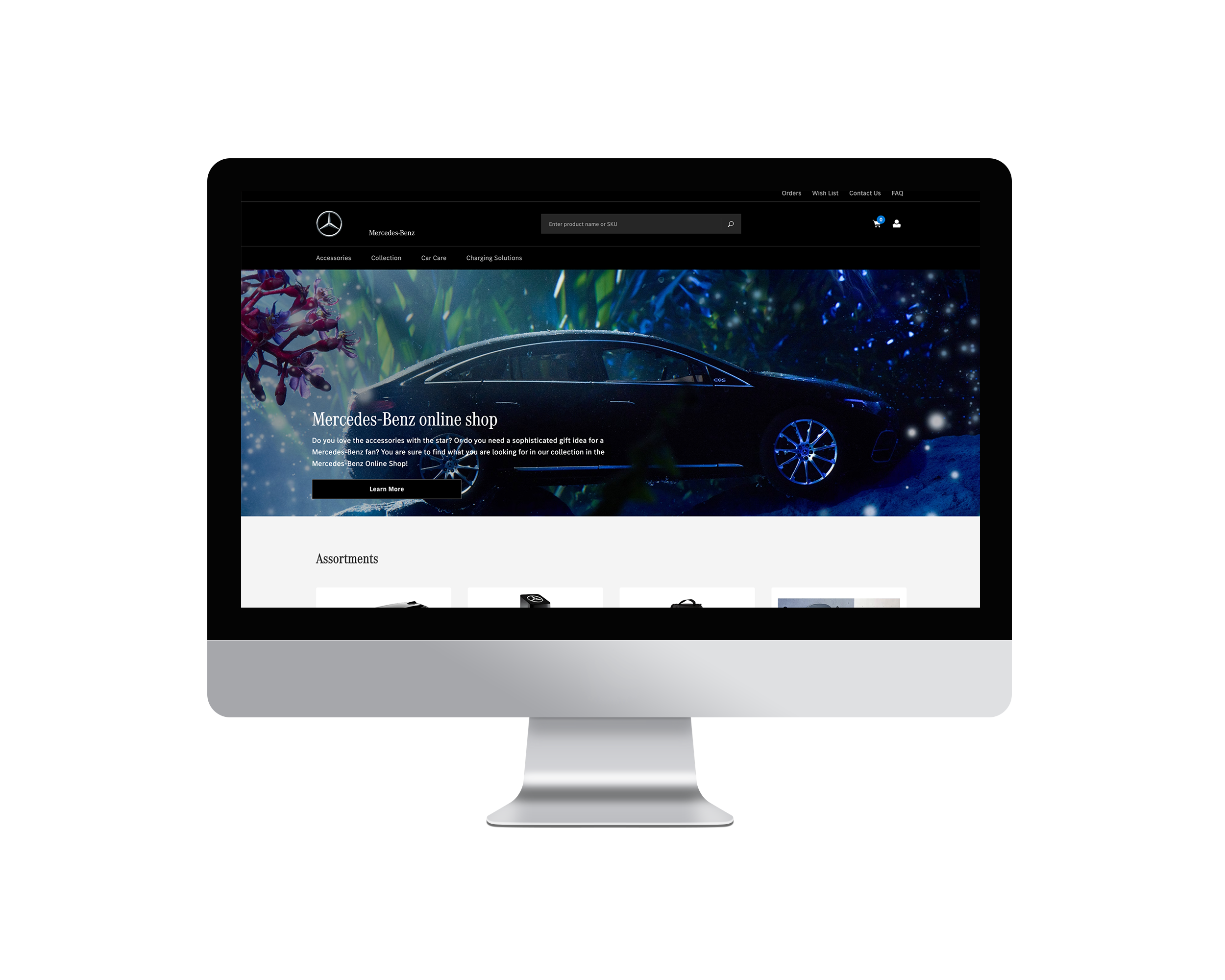
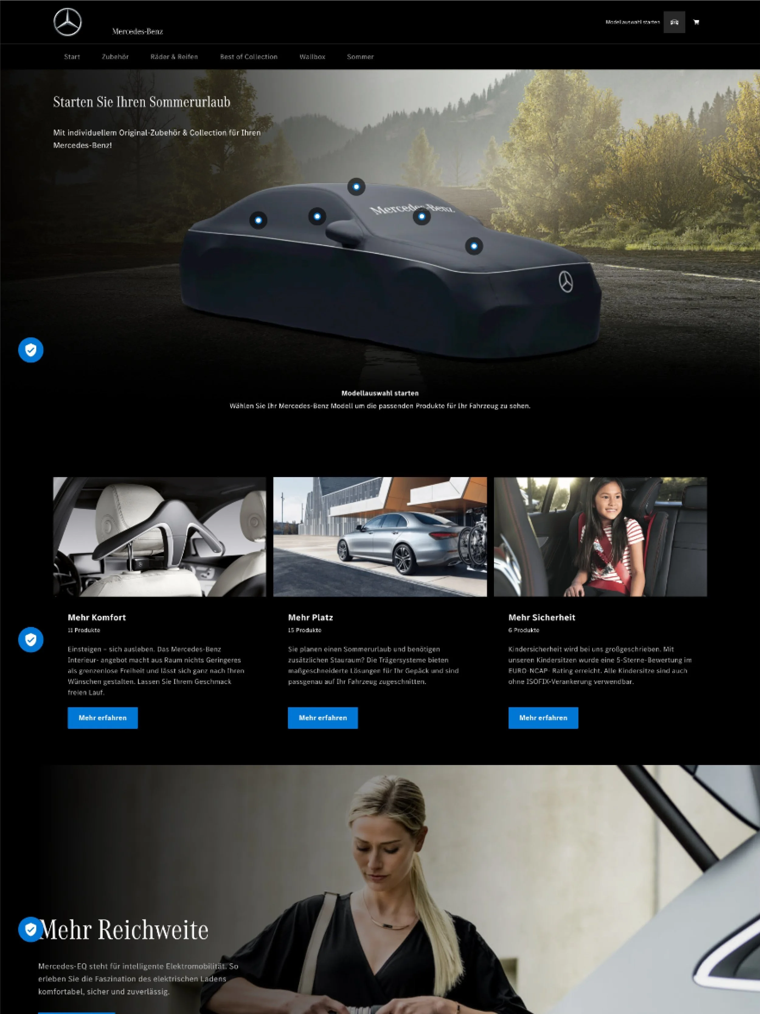
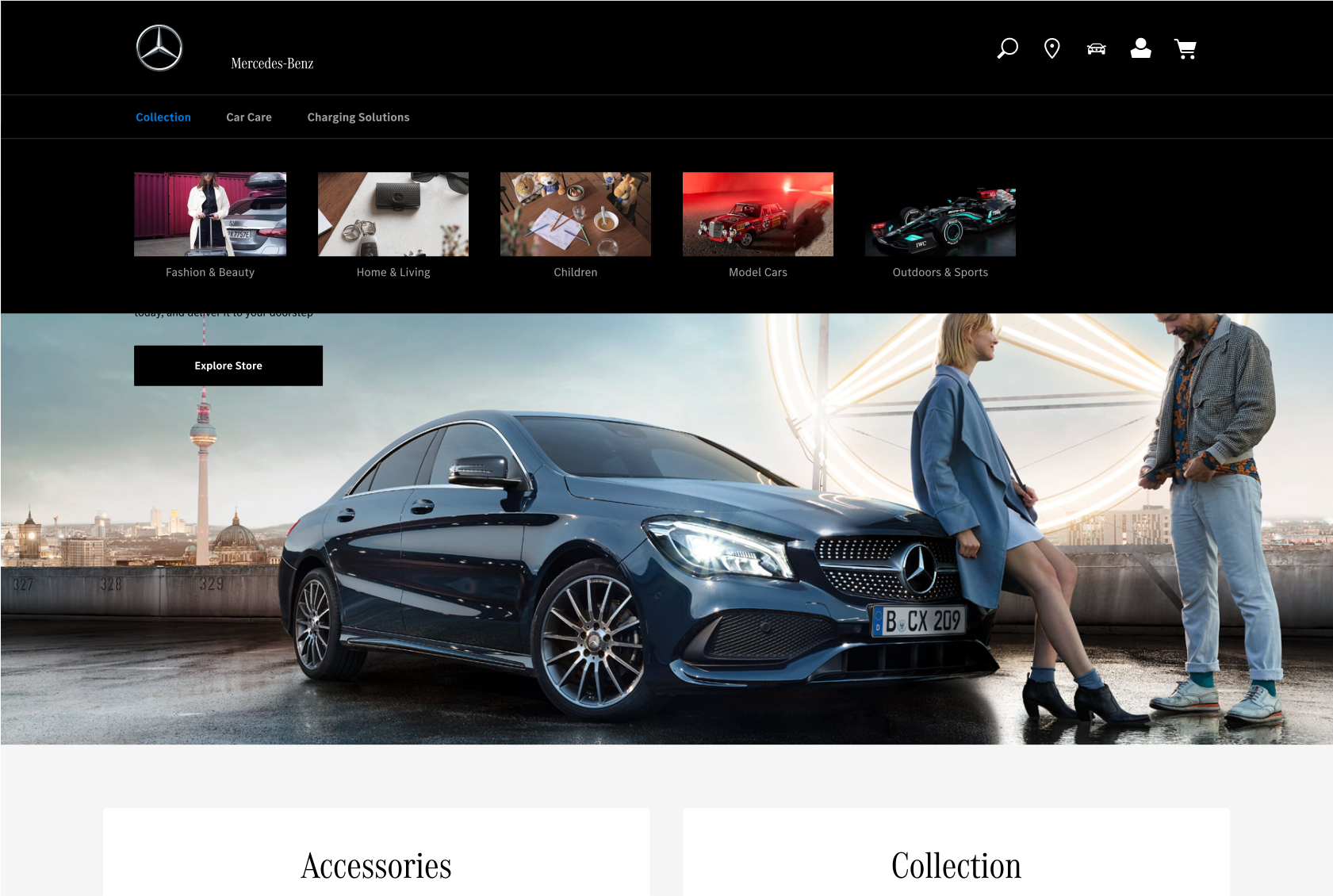
Existing Mercedes-Benz Shops


BENCHMARKING - Stage Banner
Big and bold high-quality images highlight products very nicely.
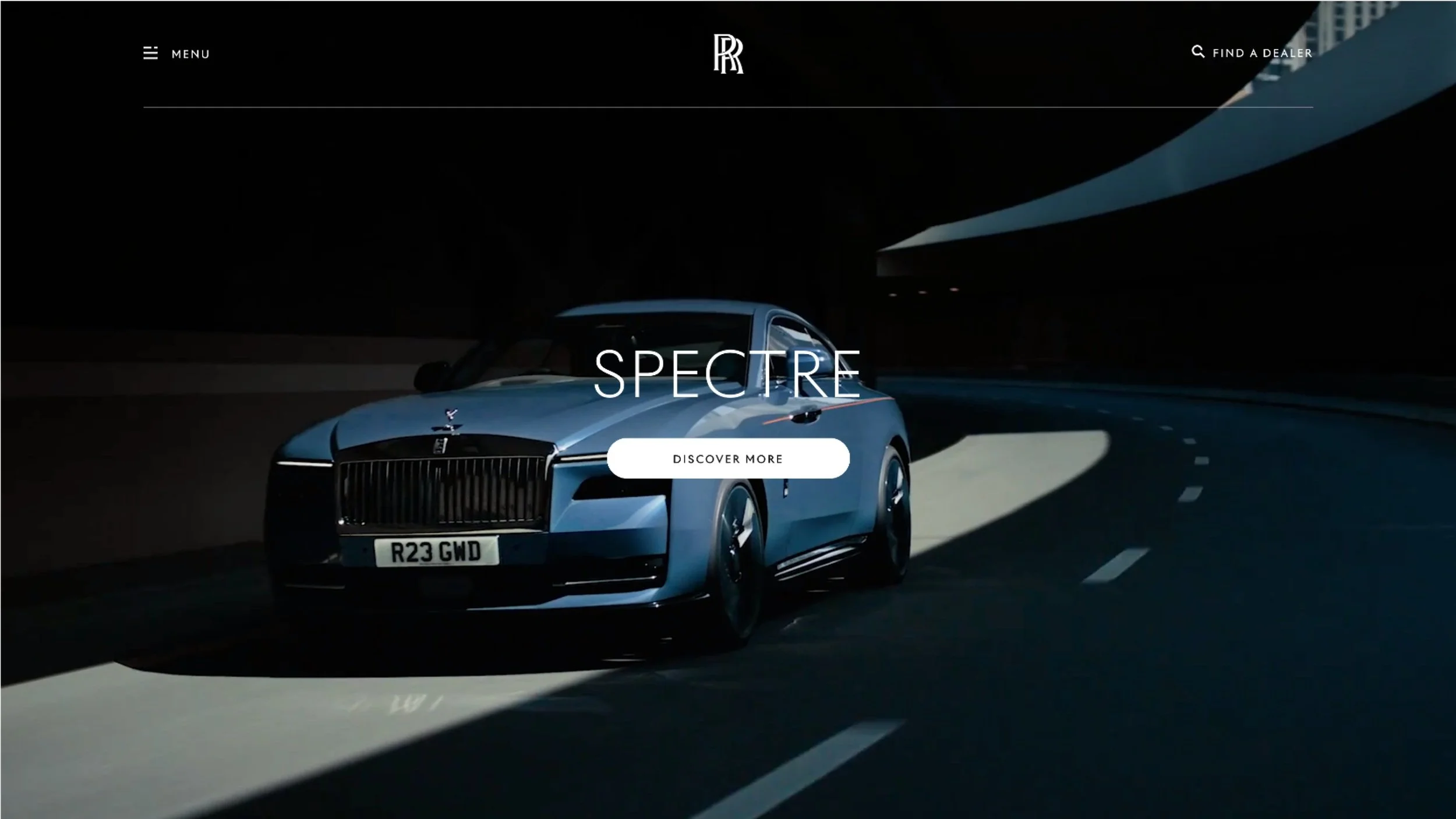
Clean and and uncluttered layout, without too much elements.
Clear call-to-action buttons that lead to important pages.
Option to feature different banners using bar navigation
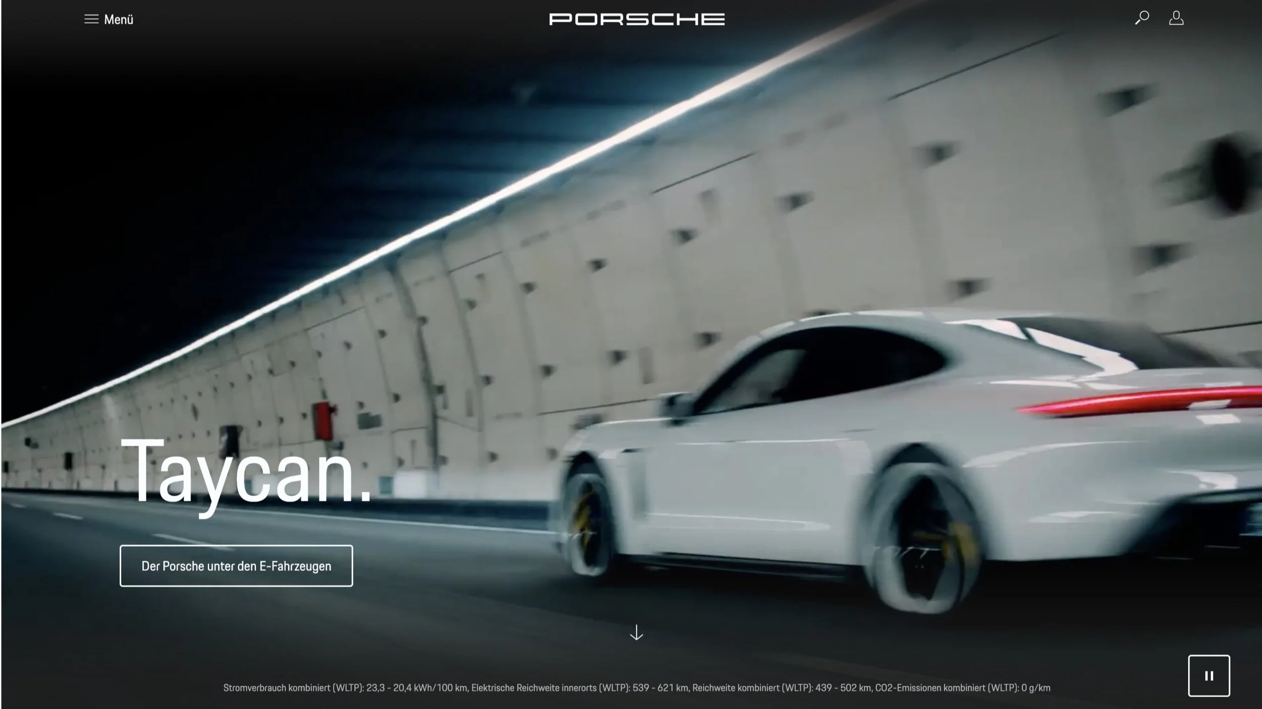
BENCHMARKING - Header Navigation
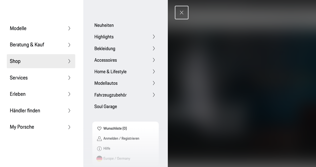
(Porsche) Having a collapsed Hamburger menu keeps the homepage clean and organised
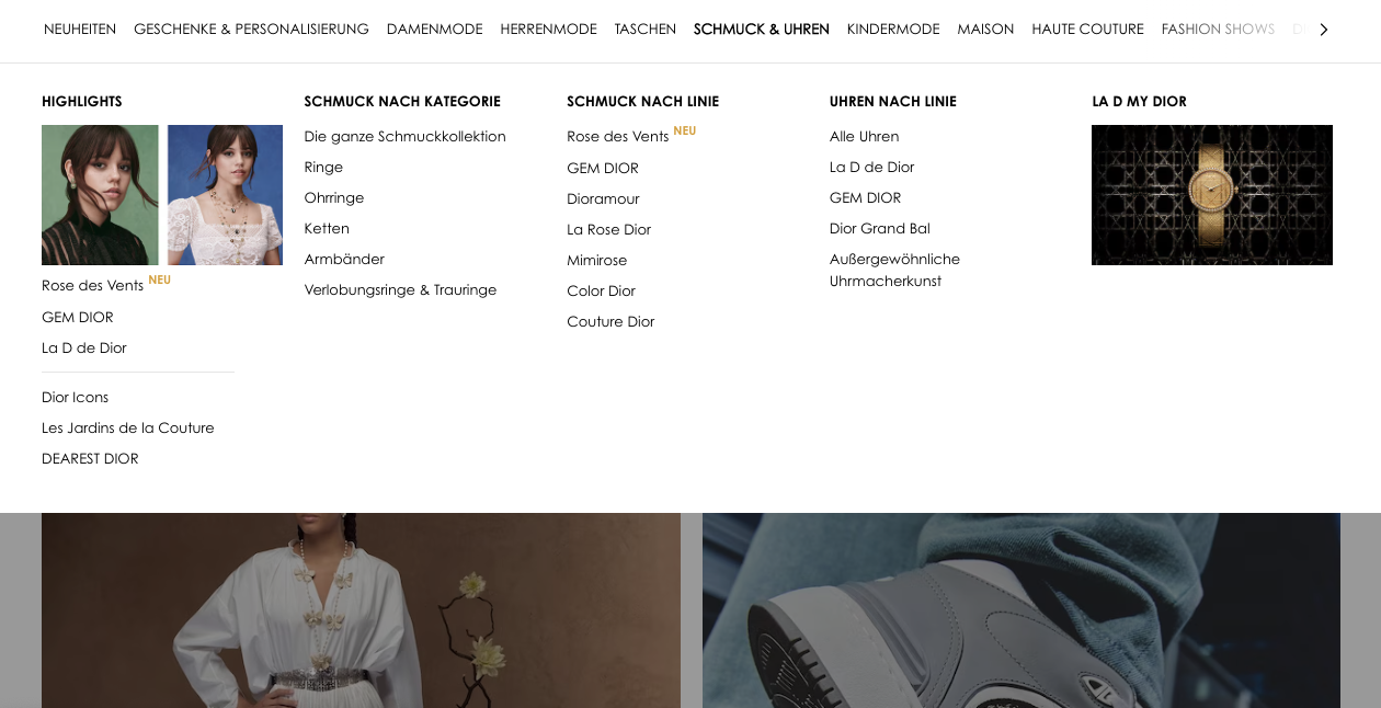
(Dior) Horizontal menu gives the option to show different levels of navigation especially for shops with a lot of products
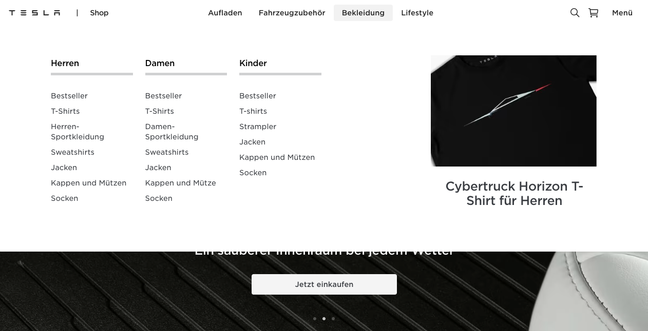
(Tesla) Company logo is always visible and features can also be highlighted in the menu itself
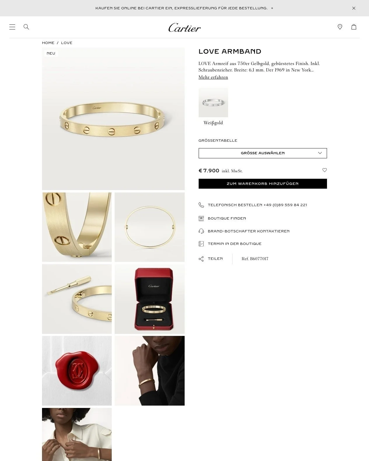
BENCHMARKING - Product Details Page

(Cartier) User has the ability to Save as favourite and Share the product to chosen social media account
(Cartier) Big and high-quality images are used
(Porsche) Product details are collapsible so not too much information is shown.
(Porsche) Product availability status immediately visible
(Porsche) Similar products are shown below
CONCEPT AND DESIGN
Design Solutions - Stage Banner
A

B

Design Solutions - Header Navigation

A
Horizontal header that could contain text or text and images. This would allow an easier flow for a header with multiple levels.

B

By grouping the main categories in a hamburger icon, we make it less cluttered in the main header. This also allows us to make the MB logo more prominent in the centre.
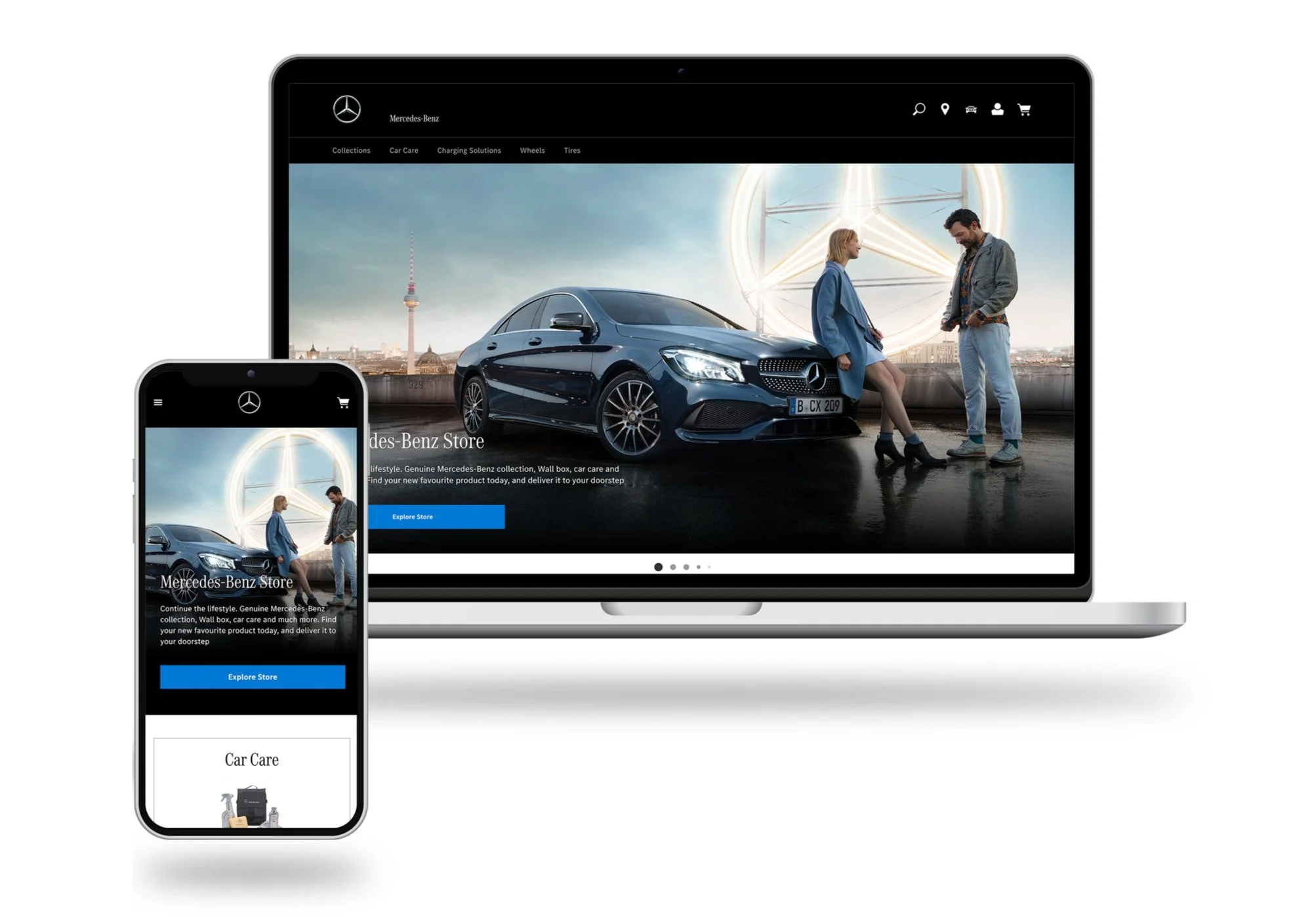
Design Solutions - Homepage

Full-width stage banner
Big category tiles
Components with different variants and are responsive
Components which can be flexibly used for articles, features, products, etc.